t’s all fun and games until someone tells you to remove the “clutter.”

This is how I did it:
I applied.
Okay, this is how I actually did it:
It was an accident.
I was a young graphic designer who could kinda code, and I had decided that I wanted to be a web developer instead. I longed for the structure and straightforwardness that code entailed.
And when that inevitably didn’t pan out for my BA-graduate self, I wanted to make the switch to Front-end. In my head that was a little more attainable than going Full-stack without a CS degree or funds to take up real coding courses in a developing country.
That’s when I saw it on one of the online job boards: UX Front end Developer
I had been searching for Front-end developer jobs because I thought I was pretty handy with my HTML/CSS, and even had a grasp on some common JS libraries like jQuery and React. (Spoiler alert: that didn’t work out either).
No matter what I did, my designer heart had followed me there. Whenever I was anywhere else, my heart was not in it the way it was with the design! Sometimes when you’re lucky enough to just know where in the world your skills and your desires fit in, you just have to go for it.
So here it goes…
Some things I learned about making the Big Switch from Graphic Designer to UX designer
…that I might have wanted to know before I accidentally fell into the rabbit hole!
1. A UX Designer can be involved in every stage of user interaction, not just the ones the user can see.
You can be involved in anything, from research to copy to wireframes to visual design.

In fact, some would argue that truly great UX Design should be invisible.
My VERY oblivious definition a UX Designer at that time was exactly this: “A designer who can code.”
I know how ignorant that sounds but stick with me.
You have to understand that as a graphic designer in an agency, I was continuously expected to pull magic out of my ass over hours of unpaid overtime. And there are absolute magicians out there, but I was just your run-of-the-mill straw girl, not some magical wizard!
To me, developers and engineers were like the New Gods. They could make something out of nothing. They made the blocks of the new digital reality — and assembled them too!

I felt that as a designer, my job was JUST to make the blocks pretty. I was WRONG.
In reality, products are made by teams that involve the hard work of many different kinds of people, including designers. And none of it ever appeared from nothing! Every successful product was built on a solid research foundation that continuously developed and scaled with each iteration.
So what did this job entail?
I was to act as a member of both the UX and Front-end teams. I would be involved in User Research and creating Design Systems and mock-ups of every level. But I could also involve myself in building upon code components and creating coded prototypes.
It was an exciting time.
2. You don’t have to know how to code.
But boy, does it help. One of the new terms I learned as a UX Designer (I still get butterflies when I say that), is Design System.
A Design System is kind of like a Style Guide that got bitten by a radioactive Octocat.
Design Systems involve a bunch of UI components like colors and typography, that can easily be combined and reused. The main difference is that Design Systems involve rigorous documentation on the hows and whys of the components they encapsulate, from design patterns all the way down to the code.
Design Systems are flexible and open to collaboration. They must help guide the product design into predictable and seamless scalability.
Do you know what else uses components? Javascript libraries. You don’t have to be able to handle Angular components or pass React props, but it is valuable to know how things are working in the background to get your UI operating on a screen.
There are many parallels like those that make it easier for both sides to understand each other, so there’s no arguing that it would be great to pick up a little of the coding craft. At the end of the day, dev or designer, we are all problem solvers. We are all here for the user.
You are a builder, too. You don’t have to make the bricks, but you have to know what they do and how high you can build while keeping the structure stable.

Feel free to continuously push the limits of what can be done, but we all still have to work within the realm of possibility (not to mention within the deadline).
3. As a graphic designer, you already know the human-centered design
You do design for humans, don’t you?
Now take that one step further into User-centered Design.
A UX Designer is a problem solver. What does the user want? What do they need? What is something they are not getting out of a product? What is something we can do better?
You can get pretty damn close to these answers with User Research. A lot of times, you might be surprised about how much a user notice is wrong with their experience.
You can make the most aesthetically-pleasing visuals, but how do you know how well it works? Research isn’t only there for the discovery phase, it’s also there to validate.
Every. Step. Of. The. Way.
Media Lab Amsterdam is a personal favorite for looking up various ways to get to know your “user” and navigating through the world of UX Research.
4. You have to learn to let go
As a graphic designer, a lot of what I did was for the “aesthetic” of it all, since a lot of the time whatever system or site I had to design already had its functions organized. And truly, there IS a place for aesthetic elements, but maybe a web-based accounting system is not it.
Every element must have a purpose, and that purpose must be backed up with research. Otherwise, for the love of god woman — Let. It. Go.
I would repeat that over and over to myself. There’s a reason they call it “The Art of Letting Go.” It takes discipline.
Of course, there is space for beauty in User Experience. There is a place for pleasure and for delight because people will always want beautiful things.
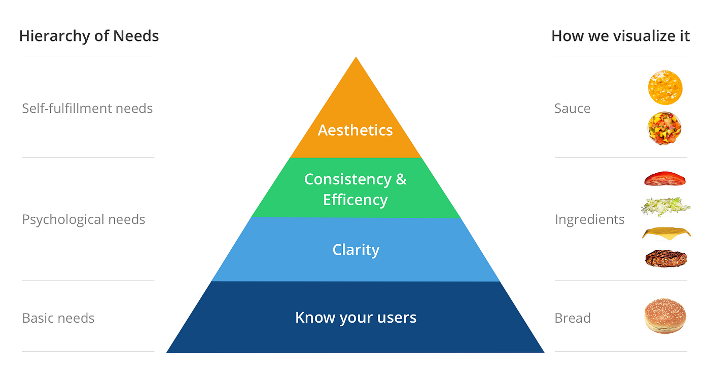
But function comes first, and Knowing Your User will always be your utmost priority.
I love this chart by Jessie Chen which I think illustrates quite well how you must adapt your priorities during The Switch.

That’s all I have for now! I am at the forefront of my UX Designer journey and would love to have meaningful discussions on what YOUR experiences were like.
Are you planning to make The Switch? From where? Of course, if you agree, or disagree I would love to know why.


.webp)